Tuesday, September 4, 2012

First home improvement project

It's been a few months since my last post and I have so much to report on! Things have been quite hectic with school, travel, home improvements and a fabulous new addition to the family, our puppy Teo (more on him soon).  Things are still a bit crazy but I'm making a bigger effort to make sure I continue blogging.This time I want to share about our first major home improvement project.

As I may have mentioned before, our lovely home was built in the 70's and although there were many updates completed before our arrival late last year, there were still a few traces of the 70s left, such as our windows and glass doors. Not quite as old but just as bad were the window treatments. 

When we first moved in, replacing the windows and blinds were definitely at the top of our list. As you'll see on the images below, they were pretty bad. The blinds were the vertical vinyl panels; as if that wasn't bad enough they were also missing a few panels, creating gaps in between. The glass doors were super outdated, they had metal frames which let all the cold air in during the winter and heat during the summer.


We are so happy with our new windows and glass doors, they look great but most importantly they are energy efficient! We also love the new blinds, after visiting every blinds store in the area, we decided on the honeycomb blinds that have the ability to be opened from top down and bottom up. These are perfect for providing privacy in our living area while allowing plenty of natural light in.

Monday, March 26, 2012

2012 Architectural Digest Home Design Show Weekend

It's been a couple of weeks since my last post and I have so much to report on. But first things first! Architectural Digest Home Design Show 2012 weekend. 

On Friday, two of my girlfriends from school (Jackie and Liz) and I met at 6:30am at Union Station to get on the first Bolt Bus to NYC for the weekend.  I was seriously regretting booking such and early bus ride but some how after a crazy long week I managed to make the bus on time, I may or may not have been the last person to board :)

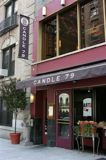
We arrived in NYC around 11am and after browsing through a couple of shops - we made our way to the hotel on the Upper East Side, left our bags, freshened-up the make-up and hair and hit the town. Our first stop was a fantastic organic vegan restaurant on the Upper East Side named Candle 79 - where we enjoyed a delicious lunch, my first all vegan meal EVER. Thanks to Jackie for suggesting it, I was pleasantly surprised, loved it!  


Our next destination was ABC Carpet & Home - a huge, eclectic, high-end home decor emporium in the Flat Iron district. It's one of those places where you can spend hours browsing and admiring the displays and unless you're part of the 1% - chances are you won't be able to afford much. We walked quite a bit to get there, so after an hour or so (and after someone who will remain nameless bought $75 pillow cases) we were pretty beat and decided to head back to the hotel. At check-in we got a huge surprise, we were  upgraded to an amazing 2-bedroom, 2-bathroom suite facing Park Ave., it was fabuLOUS!!! 


Jackie's husband Sam (a foodie and a sweetheart) had arranged our evening for us, we were expected for drinks at Terroir Bar and dinner at Hearth Restaurant. These two establishments share the same block and the same owners in the East Village. I have to say, it was one of the best dining experiences I've had in the U.S.in a while, both in terms of food/wine quality and service. Definitely worth going back to.  Thanks Sam!!! (not sure if Sam would ever read this post, but just in case :)


The next day, before heading to Pier 94 for AD's Home Design Show, we had lunch at Bouchon Bakery in Columbus Circle, this is one of my favorite places in the city for a casual lunch. I ordered the usual, a grill cheese sandwich with tomato soup, so yummy.

Later that afternoon, we finally made it to the main attraction and the purpose of this trip, the AD show. My overall impression of this year's design show was good but I had higher expectations in terms of cutting edge design and technology. My favorite part was by far the "Dining by Design NY" exhibit with more than 40 one of a kind dining tablescapes that were absolutely inspiring, this exhibit alone made the trip totally worthwhile for me. I didn't think to bring my good digital camera but was able to use my phone to snap a few pictures of my absolute favorites. 

The first is by Mark Cunningham, stunning! nuff said. The second is by NYU, this sort of avant garde garden party design was gorgeous in person, it had a very charming and sweet appeal and would be perfect for a bridal shower. As we admired it - Jackie and I immediately wondered how we could go about having a Corcoran display in future shows, we have so many talented people in our graduate program that could for sure create a design that would be just as good or better, we'll definitely have to look into that further. N'ways, back to the design that were actually there, the third is by Shawn Henderson, I loved the triangular-shaped table and stools. The entire display was perfect - the form, the cool grays, the perfect art piece and sculptural vintage lamp (unfortunately, cut-off in my picture) make for an effortless, stylish and sophisticated ambiance.

There were also some really cool technology displayed in the Kitchen area, such as the Best "SORPRESA" hood range collection. The hood range designs were very modern and chic, I absolutely loved the exhausts specifically designed for apartments/condos available in duct and non- duct versions, below.    
2 hours later we decided to hit the road again, get our bags and grab a bite to eat before our 6:30pm bus back to DC. We went with another one of Jackie's fabulous suggestions and headed to the Chelsea Market, after being mesmerized by the fact that throughout so many years of living and visiting NYC, I had never been there, we sat down at Friedman's Lunch for some pretty amazing comfort food. 


We were thoroughly enjoying our meals until one of us noticed the time (this was a total holy crap moment), needless to say, our dinner ended abruptly. At 6:15pm we finally ran out of the restaurant (while I was still trying to get a few last bites of my pulled pork sandwich, it was delish!). And I literally mean RAN, so out of character, we looked crazy, 3 girls, 2-totes and a rolling bag running through the market. With only 15 minutes to go over 30th blocks, we tried our best to stay optimistic, we really didn't have a choice, the later buses were all sold out. 

We finally jumped in a cab and told our driver "we are trying to make a 6:30 bus". A few violations of red lights later, we got dropped off on the corner of 33rd and 8th with 2 minutes to go, we ran across what seemed like the longest block in NYC. A hot New York minute later (literally), I finally caught a glimpse of the bus boarding the very last passengers. When we finally arrived, the bus driver gave us the "late" talk for arriving right at 6:30pm, apparently they sell the empty seats to standby passengers 5 minutes before the time of departure. Therefore, he wasn't sure if there were any seats left for us .You gotta be kiddin'!  

They counted the seats and by pure luck there were exactly three seats left. Liz and I enjoyed the 4-hour ride from the last row next to the bathroom, while Jackie sat next to someone so unfortunately over-weight that required a seat and a half, so Jackie sat on the half left. 

So, here are my takeaways from our fantastic weekend:
 1.  We saw amazing and inspirational designs,
 2.  Had awesome food and wine, and
 3.  Learned "don't be tardy" for the bus, otherwise, you'll end up next to the fattie or praying that no one gets up to use the bathroom (and if they do, cheer for #1, ewwwhhh... I know, still said it :)

Friday, March 2, 2012

Color & Value

Turns out my color theory class is more practice than theory, and has been seriously challenging my amateur painting skills. I have been working on value studies (value is the lightness or darkness of a color), these are simple paintings with gray scale markers on trace paper to illustrate how value can be used to create shape, focal point and mood in an interior. In conjunction, I have also been learning all about the various color schemes that can be applied in a design, such as monotone, monochromatic, analogous, and complementary.  

I should note that I did not create the basic drawings below, these were provided by the professor and my task was to use the gray scale markers to trace the rooms through the application of light and dark tones to get objects to appear, and later use color paint to apply the color scheme. 

Monotone master bedroom:

Basic drawing -


Value study - 


Monotone color study, using designers gouache paint.  A monotone color scheme is based on neutral colors such as gray, beige or cream and variations in tints and shades - 


Monochromatic living room 

basic drawing -


Value study - 
Monochrome color study. A monochromatic scheme is accomplished by using tints, tones, and shades of only one color in an interior.  In this study I chose a primary blue - 
I should mention that the flower wall paper idea was based on a requirement to incorporate a design from a Scandinavian textile into the interior.

Saturday, February 25, 2012

Current Living and Dining Space

As some may know, my husband (George) and I are new home owners. Three months ago,we bought a cozy 2 bedroom condo in Arlington, VA. The condo is centrally located, near shopping and transportation and has great space with lots of potential. The thought of having the free will to paint walls, change light fixtures and update the kitchen and bathrooms without having to change it all back, like in rentals, its super exciting. We have several projects already in mind to make this condo truly ours, but as much as we (and by "we" I mean "me") would love to just go crazy and begin tearing down walls and remodeling the kitchen and bathroom right away, we are practicing the art of restraint (again, by "we" I really mean "me"). We have a few fundamental home improvements to take care of first, like replacing all of the windows and glass doors in the unit before I can have a go at the cosmetic changes.

Fortunately, we were able to fully furnish the condo using the existing furniture we had in the rental unit. We did add a few new pieces to the dining room - a glass dining table and light fixture. The dining room project continues, as we are in the market for the perfect area rug and chairs, we are also awaiting a fabulous art piece that will hang on the back wall, where we currently have four silk-screen prints from Puerto Rico. I'll be sure to add new photos when it gets here.

A few weeks ago, we also purchased a new sofa and chair for the living room that we expect to receive in a couple of weeks. In the meantime, here's what our current living and dining space looks like.

LIVING/DINING SPACE 


Thursday, February 16, 2012

It's as simple as black & white

This week I completed my first mood boards, I have to admit that it's a lot harder than it seems.  It's very time consuming to research and gather images that are aimed to illustrate a theme or inspiration that will then translate into the design of an interior space.  The first board (below) illustrates the inspiration. As you may recall from my previous post, I'm currently working on a class project with the country of Turkey as my main inspiration. I have to design a contemporary space and a traditional space.

This is the theme board for the contemporary space, my master bedroom. To develop this theme, I focused on the presence of black and white geometrical shapes found in Turkish textiles, architecture and culture. It was tough choosing which images to display since there were so many, but in order to design a mood or theme board that is clear and precise I had to edit, narrowing it down to the best 7 images. The theme board can also include 3-5 key words that express the overall look and feel, as you can see below I chose to incorporate words on my board. 


1. Turkish Sufi (Whirling) Dervishes  2. Pillow with Geometric Patterns  3. Traditional Turkish House  4. Turkish Suzani-style Pillows  5. Arabesque (Islamic Art) Pattern Tile  6. Turkish Hamam Towel  7.  Turkish Bath (Hamam) House

Once my theme board was completed, I worked on the mood board for the room. The mood board is where I place images that illustrate the specific furnishings, flooring, textiles and accessories inspired by the theme board. The mood board is sort of a wishlist, here's the board I developed based on the theme board shown above. 


1. Alison Queen Headboard bed by Ethan Allen. I chose this item because it can be upholstered in several fabrics and colors, I also like the geometric shape of the headboard which reminds me of the geometric patterns found in Turkish architecture.   2. Shyrdak Pillows found on l'aviva home - a website that features a series of curated collections featuring handcrafted homewares from artisans around the globe.  3. Terra Bella Pavers - San Felipe Tiles. These are really cool jet black tiles with a high gloss from a company out in California called Mission Tile West. I'm completely obsessed with these tiles, I think the color and pattern works great for flooring but I can also see this as a really cool wallpaper design. 4. White bed linens 100% Egyptian cotton, simple and luxurious.  5. Bride & Groom Crystal Lamp by Horchow. This lamps is great! Crystal lamps are in trend and would be ideal in this space, the shapes also compliment the geometrical pattern inspiration and and color scheme. 6. Kilim Black & White sofa by Andrew Martin. This absolutely stunning sofa with vibrant pattern would be the focal piece in the space. This piece is perfect, it adds a traditional/ethnic feel without compromising the sophistication and modern aesthetic.  7. Deco Venetian Mirror. This mirror is a great find, it plays really well with the design of the crystal lamp, tiles, nightstand and the headboard.  8. 100% Egyptian cotton decorative white pillow. Adding some basic pieces will help maintain the simplicity and balance between all of the patterns, shapes, contrast and colors.  9K by Keaton K-Stitch Striped Throw Blanket sold at Bed Bath and Beyond. Black & white stripes are must for this color scheme, again inspired by stripes on Turkish tiles and architecture. 10. Topkapi Rug from Grandin Road. Inspired by ancient Turkish tile work, the Topkapi Rug is a magnification of the remarkable mosaics found at the historically significant Topkapi Palace in Istanbul. The graphic, asymmetrical pattern of vibrant blues, gray, and white lends itself to both modern and traditional décors. It also adds a splash of color to the room, which would otherwise be all shades of black and tints of whites.  11. Turned wood pedestal table in high gloss black from Brocade Home. Love this table, the shape is simple, the high gloss reflective surface connects with the mirrors, the sculpture and the Terra Bella Pavers.  12. Sara Chandelier by John Lewis. This fabulous chandelier inspired by hanging lanterns found in Turkey and Morocco would hang in the center of the room, it's simple and elegant, and will go perfect with some of the other crystal/mirror pieces in the space.  13. A sketched floor plan of my master bedroom, important to have the space illustrated so that you can start picturing placement.  14. Silver Dervish Sculpture. Accessories are a great way to add the cultural references. This silver sculpture is ideal, repeating some of the round shapes found throughout the room and adding a sense of movement.  15 Cane Throw from Cococozy. A great way to add anther texture to the bedding, plus color - playing off of the blue from the area rug.  16. Black & White Resin frame, found on OneKingsLane.com.  17. Austin Mirrored Nightstand from Modern Sense Furniture. Mirrored furniture made a huge comeback in the last few years, this nightstand just adds a lil bit of glam. Reflective surfaces are also great to brighten things up.
 
A great way to create cohesion within a space is to subtlety repeat patterns, details and shapes. All of the furnishings selected must relate to one another and to the main inspiration.

Friday, February 3, 2012

Three weeks in = Inspiration

I'm very excited about the classes I'm taking this semester - Color Theory, Intro to Interior Design and Textile Designs. Although each class has a different focus,  I've noticed there's one common theme in all three, inspiration.

During studio and lectures inspiration talk is always present, the professors are constantly asking "what inspires you?". At first, it definitely seemed like a very broad question, there are hundreds of things that I'm inspired by. However, in the past three weeks I've learned to quickly narrow down that broad thought and find inspirations specifically related to a project or an idea.

One of my professors said that when it comes to interiors designed by a pro, we have to observe it like a work of art, as if we were looking at a photograph or painting in a gallery trying to figure out what inspired the artist to create that piece.  It's the same with interiors, designers also develop a concept and gather inspiration from various sources in order to develop a design.

The first project for my textile design class is all about inspiration and concept. I have to select a country, and then search for inspiration within the country's culture to develop an interior using textiles. Turns out that I actually have a little trip to Istanbul coming up in March, so my decision was pretty easy... Turkey would have been at the top of my list anyway because it has such an amazingly rich culture, it also happens to have a great textile industry.

Within the last couple of days I've spent hours looking at images depicting Turkish culture - their architecture, bazaars, rugs, bathhouses, arts and crafts, and traditions among many more. I'm most attracted to the geometrical shapes and patterns used in tiles, rugs, fabrics, and architecture. I've also noticed that if you look closely you can distinguish two very different color palettes in the Turkish culture, one is very rich and bold with violets, reds, oranges, yellows, blues, and greens and the other is very black and white with lots of contrast. I decided that these two color palettes and the geometrical patterns will take center stage in my textile design project.  

Early on my professors advised that all students have a binder with clippings and cut-outs of images from magazines, newspapers, catalogs, fabrics, etc. that we found to be inspiring. The goal is to develop a personal/visual inspiration and reference guide that will be very handy as we continue to work on specific projects. This week, I finally got around to buying a 1" binder to organize my reference/inspiration book. When I finish inserting all of the clippings I've collected thus far,  I couldn't help but noticed how uninspired I was by the exterior appearance of the "inspiration book" itself. It was in desperate need of a drastic makeover.

After seeing so many beautiful shapes and colors related to Turkish culture, I decided to put all this talk of inspiration into action, and design a binder cover that would be more appropriate.  Inspired by two of the images shown above (in the set of black & white images), I decided to create a design with the black and white zigzag shapes on the pillow located on the top right corner and the center flower-like design on the image on the lower right corner.

The first step was measuring the front cover of the binder and sketching the design on a piece of tracing paper, before drawing in the patterns and details I drew a rectangle corresponding to the size of the binder so that I could keep my design within the correct measurements. 
 
Then, I transferred my design to a piece of 11x14 watercolor paper using graphite transfer paper. Once my design was transferred, using a small brush I painted every other zigzag line with black gouache paint.

Instead of keeping all of the original colors displayed on the images, I decided to mix it up a bit by adding a splash of color on my design. I mixed yellow and red paints to get a nice bright red-orange color that would go around the "flower" shaped pattern, which I decided to leave white.

Once the painting of the zigzag lines and red-orange base were complete and dry, I used an X-Acto knife and a cork back stainless steel ruler to trim the sides of the paper to the exact measurements of the front cover insert of the binder. 

And of course, in true makeover fashion, here's the infamous BEFORE:


And the fabulous AFTER:


Now that's more like it!